Sunday, February 13, 2011

urban intervention - continued


 Walking around Watney Market last weekend made me think and I listed simple design requirements for the project

 - increasing the number of stalls
 - making them more attractive
 - widening the range of goods on sale + catering facilities (flexible design of the stall that will allow to display different sorts of products or set up mobile catering equipment)
 - space for presenting boxes with vegetables in front of the stall
 - change current positioning of the stalls – they cover shop windows from the eyes of the passing crowd

I have also played around with those geodesic-dome elements. I think it resulted in some smooth shapes for the stalls roof. One thing that bothers me is the fact that multiple amount of little stalls may not be good enough. There is a limited space between shop windows on each side and a continuous structure going through the middle of the market would be an ideal solution in that case.


urban intervention - stall idea

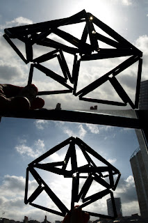
i have been playing with some straws today and ended up with this geometrical, stall-like structure. i was going to develop it further into an actual model, but the lines seem a bit provoking and i think they would disrupt the empty watney market area too much. in order to enhance the area visually, I need to look for something that will integrate more with the straight lines of the buildingsand gently fill the grey, open space.


urban intervention - watney market


In the early years of the 20th century it was one of the liveliest local markets in London: in 1902 there were over 100 shops and 100 stalls.
By the 1960s Watney Market was in decline: people were moving away, and beginning to shop elsewhere. By the end of the decade only a handful of stalls was left.
Sites were cleared for redevelopment - housing and a new market - but it was slow in coming.
Twenty years on, the rebuilding is now more or less finished, and the area has been expensively landscaped, but its character has gone. There are no permanents stalls and the product range seems to attract only a few out of the whole group of passersby.


Monday, January 24, 2011

hinge+fold

I've been experimenting with membrane hinge and different kinds of folds.

Membrane hinge is a brilliant way of building shapes. My model is made out of plexiglass pieces angled at 15 degrees on the sides. The outcome is a half-circle that can be laid flat or folded to save space.
it could be a roof structure, a shelter...

I had this idea of making membrane hinge chair where the shape would be determined by the angles of individual components.


Sunday, January 23, 2011

table stand

Could be used as a reception table etc
Sheets of plexiglass are joined together to form solid see-through walls. The table top could be made from CNC-cut thick sheet of plywood (ca 50mm, could be 2 sheets joined together).


pencil pouch

It is a simple concept - old cardboard covered in liquid latex to reinforce. The outcome is really cool - it is big enough to keep my whole drawing kit, so far it doesn't seem to fall apart anywhere (I've been using it for couple of months now) and I really like its rugged looks. Latex doesn't get dirty and there's no problem in case you spill a drink over it. It still needs two pieces of velcro to close the lid properly.


Friday, January 21, 2011

camera case+ cage

I have recently developed the idea of compact slrcamera case. I have noticed that there are no compact camera cases that would b It should be:
rugged - cardboard + latex is a good idea (have a look at the pencil pouch)
compact - in a shape of the camera, foldable (flat) so that we can save some space while the case is empty
perhaps even waterproof

Thinking about the shape - I really like the idea of the orishiki suitcase. It is sleek, stiff and can be stored flat.
The camera case could be made using the same principle.

Here is a really nice kinetic sculpture by studio lab[au]. It reminds me of some sort of membrane hinge surface. i think it is a good concept for creating the shape of my camera case.


panelling idea:


I also had this mad idea of creating a camera cage. It would provide maximum possible protection for the camera. Perhaps it could be an addition to the camera case. The case provides protection from dust, dirt and water and the camera cage protects it from everything else - being squashed, stood on, dropped etc. I imagine it would be a part of travellers kit, perhaps the camera could even be used while staying in the cage.
Here are some pictures of a prototype I've made:


Wednesday, November 3, 2010

multiples

i saw some wooden palettes around my building recently. it could be a nice source of free material.
couple of days later i realised someone had similar idea: